Cart Drawer – smoother, faster ecommerce UX
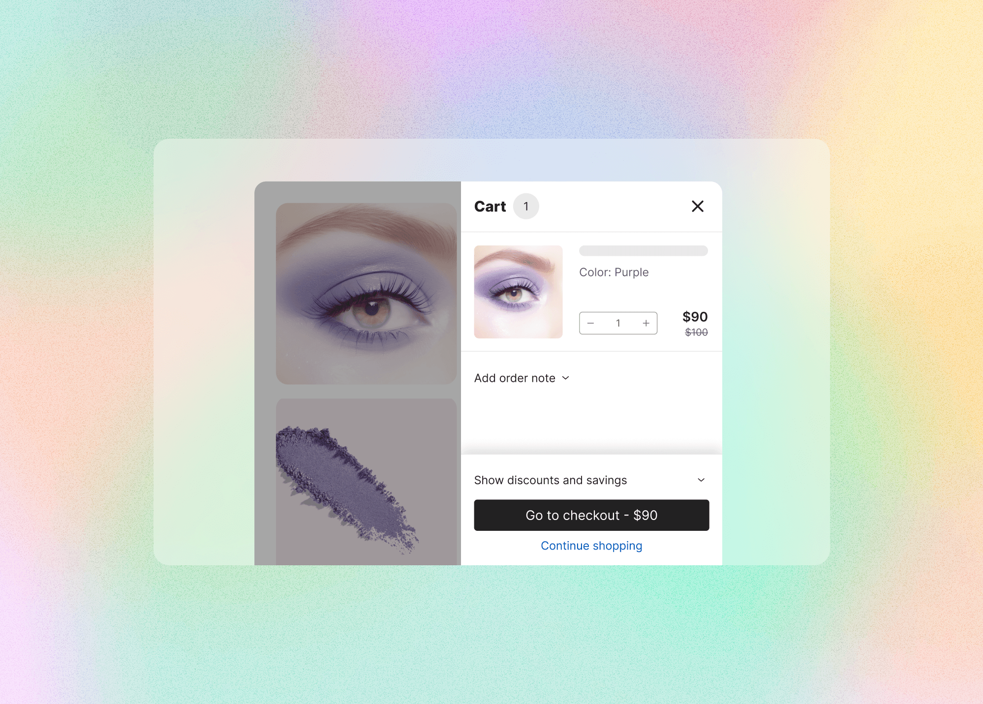
A custom, accessible cart drawer built to replace unreliable third-party solutions — improving retention and giving merchants a native way to boost sales with Vitals.
44×44px
Touch targets
2.1 AA
WCAG standard
4–5 wks
Discovery to handoff
UI/UX process
We kicked off the design process with competitive analysis and best-practice research, focusing on strategies proven to increase conversions in cart interfaces.
Key UX principles we followed:
- 01Clarity of product information — each product in the cart displays a thumbnail image, name, specifications (like size or color), and quantity, so users can easily review their order.
- 02Clean, focused layout �� we avoided clutter and limited the number of upsells and promotions shown, to maintain a frictionless path to checkout.
- 03Persistent checkout access — the checkout button remains visible across screen sizes, ensuring easy access regardless of device or resolution.
- 04Accessibility — the drawer works well with screen readers and can be fully navigated by keyboard, with WCAG-compliant contrast and tap targets large enough to hit on any device.
Design system & component structure in Figma
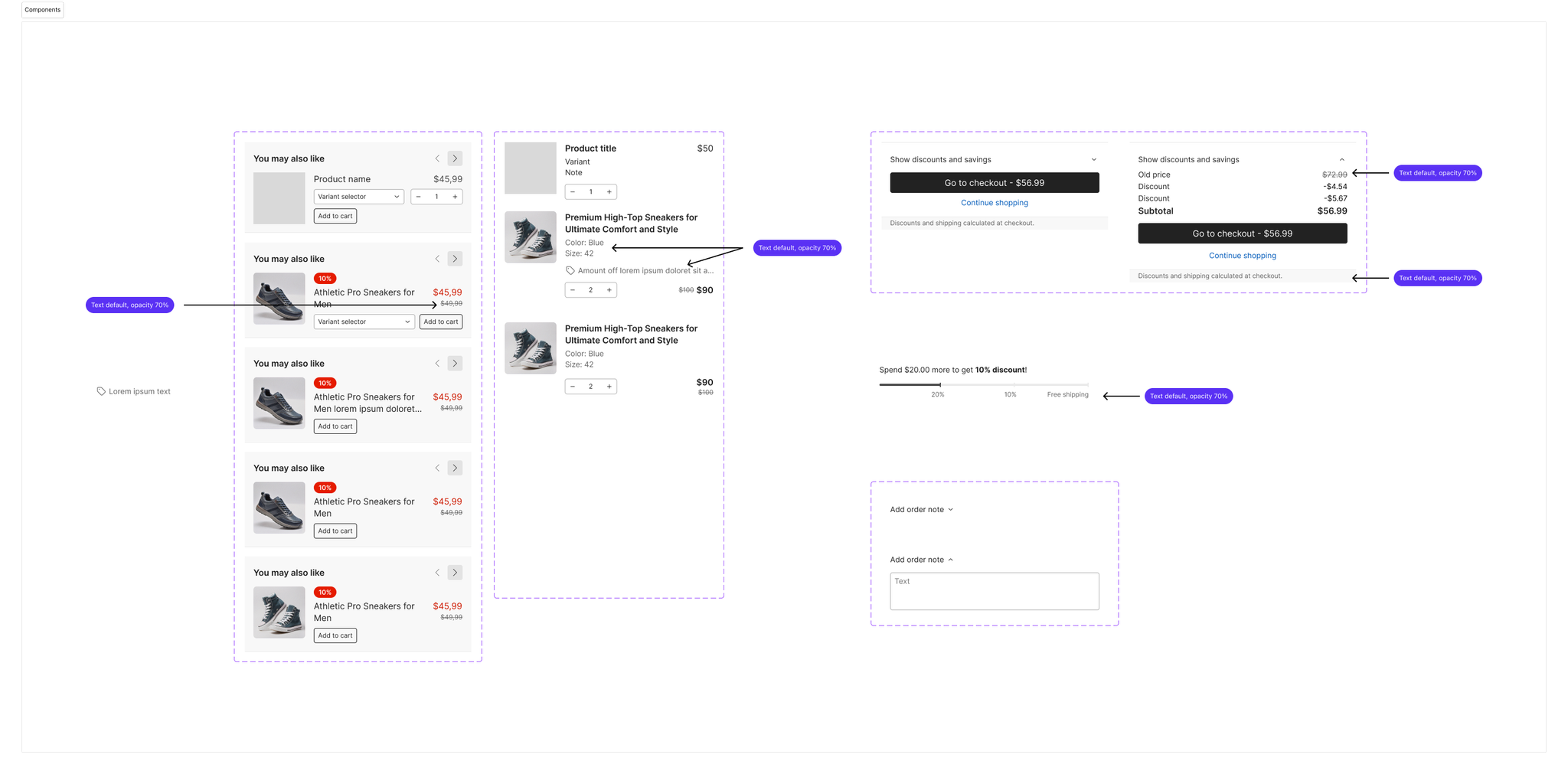
To ensure consistency, speed up implementation, and make the cart drawer scalable across merchant setups, we built the UI using atomic, reusable Figma components.
We broke the drawer into modular sections — Products, Upsells, Sticky Checkout, Spending Goal, Order Note, and Discount Summary — each designed as a separate component with variations (collapsed/expanded, filled/empty) that stay visually and functionally consistent.
- 01Used Figma variants and component properties (boolean toggles, instance swaps) to manage complexity while keeping the file easy for developers and collaborators.
- 02Built the entire drawer in a modular layout to support future iterations and A/B testing without redesigning from scratch.
Component design & developer handoff
Close partnership with engineering was key. We established a shared workflow that made handoff fast and low-friction.
- 01A shared Figma library with components and tokens, enabling faster dev handoff.
- 02Clear documentation on naming conventions, behavior specs, and edge cases.
- 03Regular syncs to discuss blockers, performance optimizations, and accessibility fixes.
- 04A post-launch feedback loop to iterate based on real merchant usage and evolving product needs.
By treating the cart drawer like a mini design system, we made it easy to maintain, expand, and reuse across storefronts — without design debt or guesswork during development.
Accessibility
Accessibility wasn't an afterthought — it was a core part of the design and development process from the start. We wanted the drawer to be usable by as many people as possible, including those navigating with screen readers, keyboards, or assistive technologies.
- 01ARIA labels & landmarks: role="dialog" for proper modal semantics, aria-labelledby tied to the heading, aria-describedby for upsell and discount context, and careful aria-hidden use to keep screen-reader focus inside the drawer.
- 02Keyboard navigation: a logical tab order, focus trapping while the drawer is open, and ESC-to-close that mirrors modal dialog behavior.
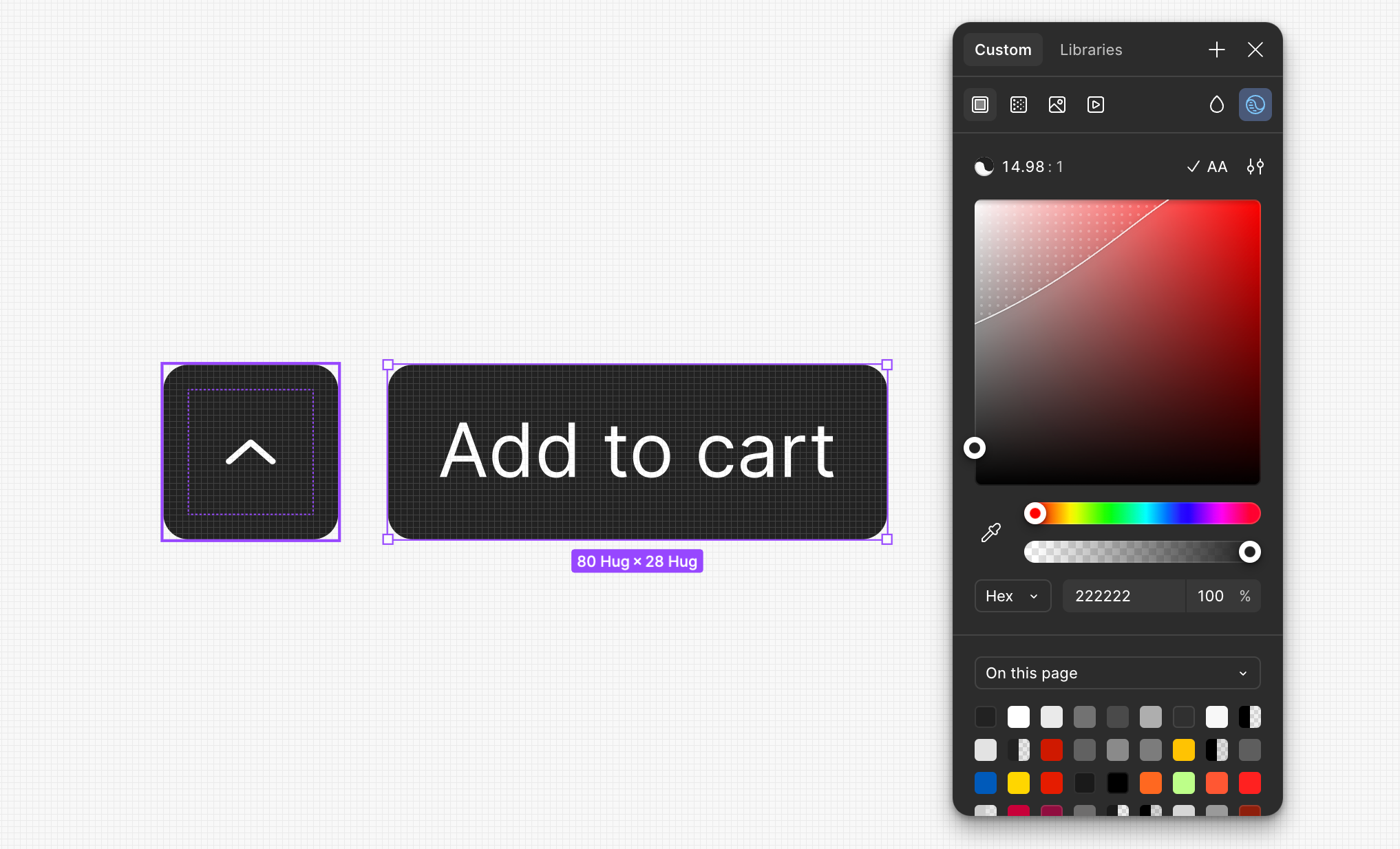
- 03Color & contrast: WCAG 2.1 AA contrast ratios for all text, especially interactive elements like buttons, notices, messages, and discount badges.
- 04Tap target sizes: quantity selectors, remove buttons, and upsell CTAs all designed with a minimum 44×44px hit area to prevent frustration on mobile.
Responsive design: variants by device
To ensure an optimal experience across devices, we designed and tested the drawer across a range of screen resolutions — each breakpoint chosen to represent real devices in our customer base and to surface layout or behavior inconsistencies.
Edge cases handled:
- 01Overflow & scroll: every variant has scroll logic when content exceeds viewport height.
- 02Content scaling: typography and icons scale slightly down on smaller breakpoints.
- 03Touch targets: all tap areas meet minimum guidelines for mobile usability.
- 04Safe areas: padding adjusted for device safe zones (iOS notch, bottom bars).
User admin
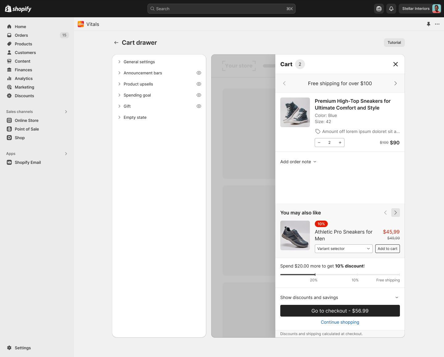
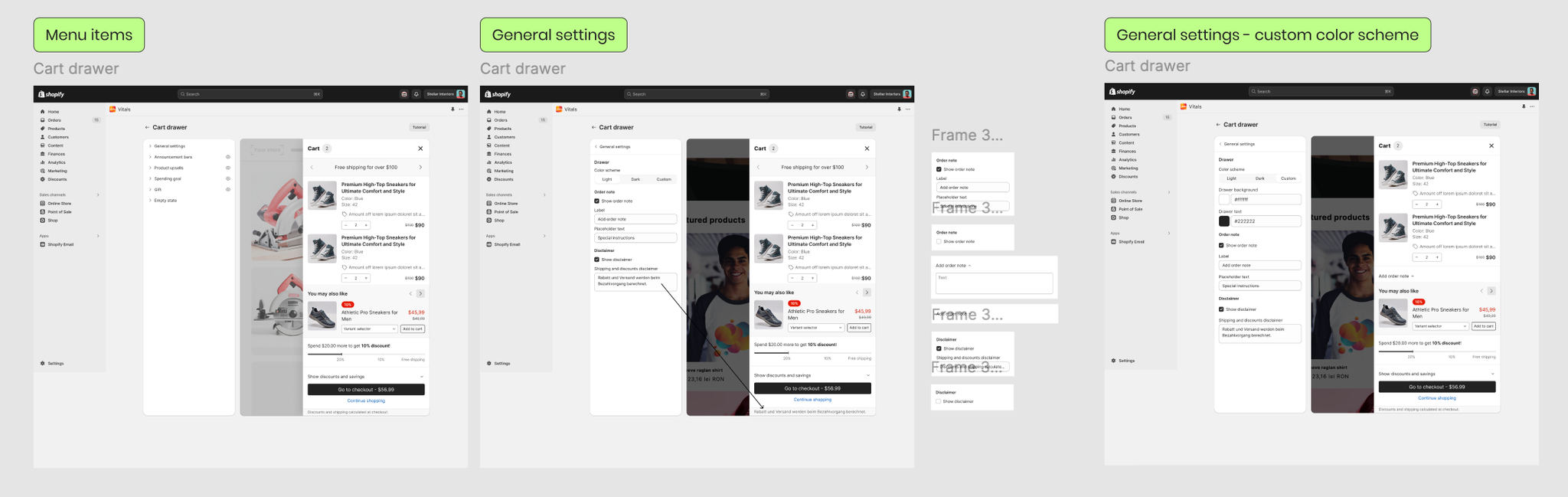
The interface is built using the Shopify Polaris design system, ensuring accessibility, consistency, and a native admin experience aligned with the rest of the app.
Working within Polaris constraints, we used Figma components that mirrored Polaris patterns to make handoff seamless — with a few adjustments to bridge the gap between Polaris defaults and our custom needs:
- 01Preview embeds: since Polaris doesn't natively support live previews, we designed a scrollable drawer mock inside the admin for real-time visual feedback.
- 02Custom component overlays: certain settings (e.g. upsell rules) were layered with collapsible panels and helper tooltips to reduce visual overload.
What I learned
- 01Accessibility isn't a checklist — it's part of thoughtful, inclusive design, and building for real-world edge cases (screen readers, color contrast) requires collaborating with devs and testers early.
- 02Simplifying a flow often means removing choices, not adding features.
- 03Even small visual tweaks — spacing, button hierarchy — can drastically shift user behavior.
- 04Working closely with developers from day one leads to better outcomes and faster launches.
- 05Designing for reuse requires thinking beyond the current screen.