Designing a ride booking portal every Medicaid member can use
Accessibility driven redesign of a Medicaid non-emergency medical transportation (NEMT) portal. Audited flow by flow, rebuilt in light and dark mode with state-specific variants and designed to WCAG 2.1 AA.
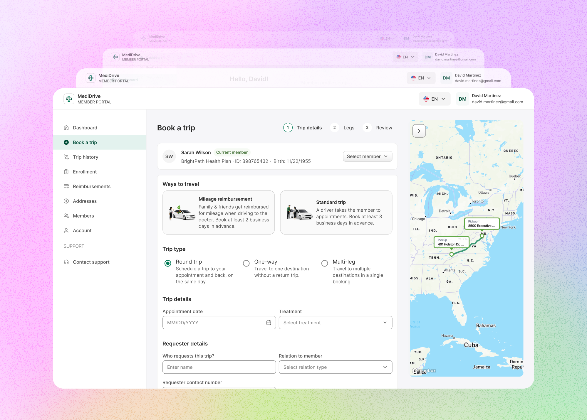
Audited and transformed a dispatch-heavy interface into an intuitive, accessible portal built specifically for caregivers and members aged 65+.
WCAG 2.1 AA
Accessibility
Light & Dark
Theme Support
UX for elderly users
State Variants
Context
MediDrive allows members to schedule and manage rides to medical appointments. The audience is older, less tech-savvy, and reliant on benefits. A demographic for whom a failed booking is more than a minor inconvenience; it is a missed appointment.That single fact set the standard for the entire redesign: the portal must make the next step clear and never fail silently.
The existing portal had accreted feature by feature, borrowing patterns from operational/dispatcher tooling that were wrong for members. So I audited it before touching the UI.
I led the audit, flow architecture, and accessibility. I partnered with Liviu, the other senior product designer on the team, to fully redesign the member app and portal in light and dark mode.
Status: design complete, not yet in development.
The engineering perspective
The redesign was shaped by the way design decisions travel into real products: through shared language, accessible systems, edge-case thinking, and close collaboration with the people who build the experience.
Oana is one of those rare Lead Product Designers who naturally steps up whenever a project needs direction, clarity, or a bridge between design and engineering. Her design decisions were directly responsible for us passing every accessibility audit without friction.
Serhii Nadoienko
Frontend Engineer, Technology Oriented
The audit
I ran a flow-based heuristic evaluation, not a screen skin, across the four journeys that mattered to the business: New user, Existing user, Multiple members, and Mobile. Each was evaluated against Nielsen’s 10 usability heuristics (Nielsen Norman Group) and WCAG 2.1 AA (W3C) — because a Medicaid-adjacent product carries a usability and a legal-conformance obligation.
The findings clustered into five core themes:
- 01The portal repeatedly put users into blocked states without telling them why or what to do (e.g., multi-leg booking disabling "Continue" without feedback, missing service levels blocking progress without explanation). Violates Heuristics #1 & #9; WCAG 3.3.1 & 4.1.3.
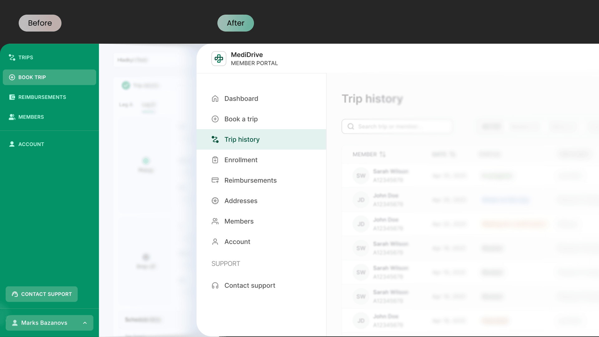
- 02Layouts borrowed dispatcher mental models (dense operational grids, searching by Trip ID, jargon like "Legs") rather than providing intuitive tables and member-first flows. Violates Heuristics #2 & #8.
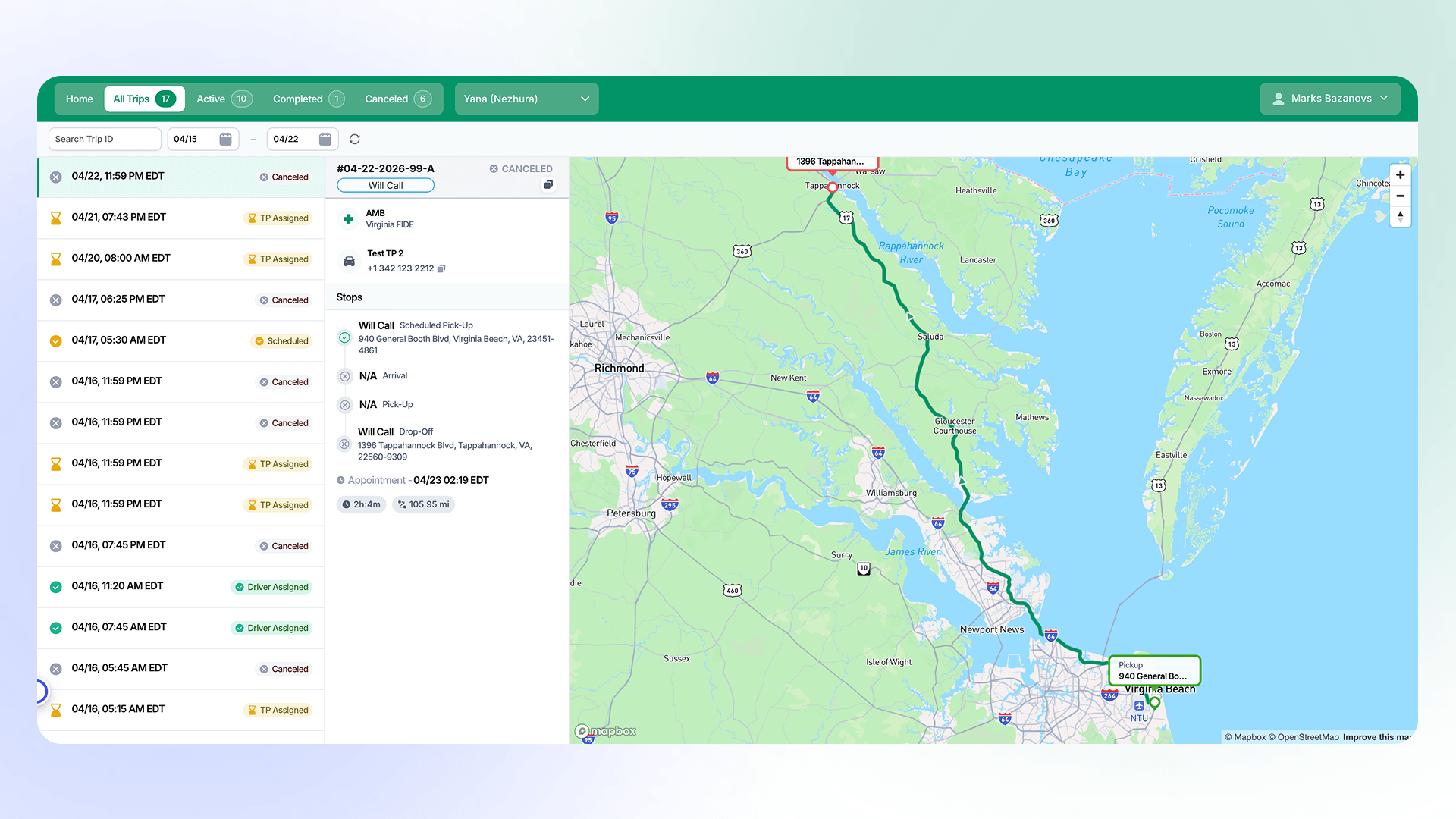
Dispatcher mental models (dense operational grids, searching by Trip ID. - 03Inputs that could not be completed via keyboard (WCAG 2.1.1 Level A failure), pervasive low-contrast elements (WCAG 1.4.3), and insufficient badge font sizes for older adults.
- 04Premature error states that alarmed elderly users into thinking they made mistakes, alongside confusing and misleading empty panel states.
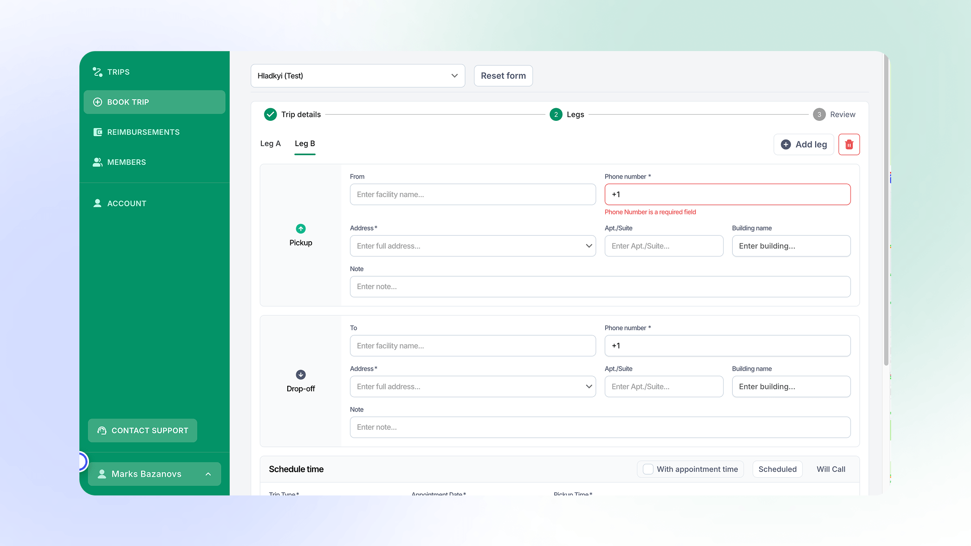
Premature error states that alarmed elderly users into thinking they made mistakes - 05Orientation and feedback gaps: Lack of branding/location hints, no multi-step registration progress indicators, and transient feedback/tooltips that vanished before being read.
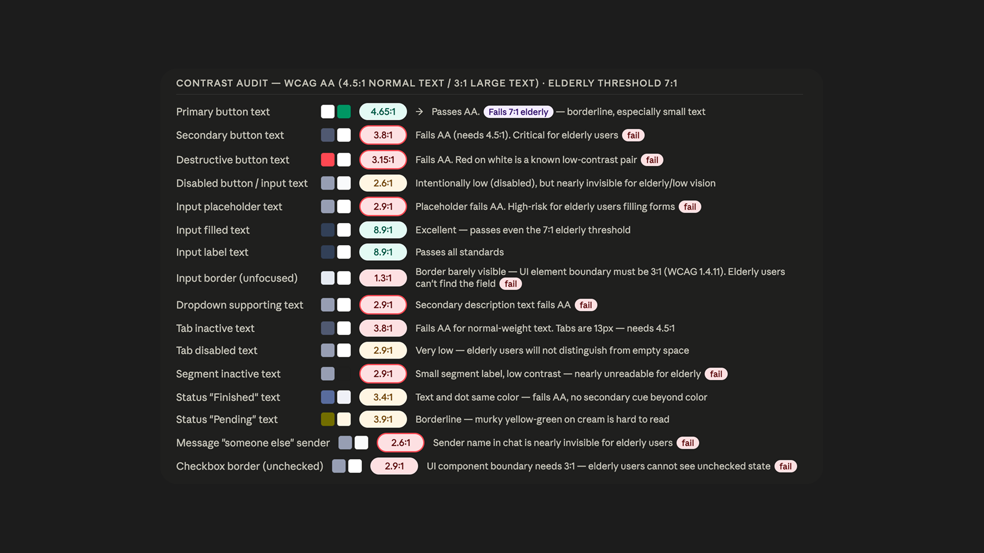
Flow-based heuristic and accessibility audit matrix mapping critical user friction points.
In the multiple-members flow, selecting a member from the dropdown failed to update the trip list automatically, forcing manual page refreshes. A functional defect the redesign solved structurally.
Principles
Three non-negotiables, drawn straight from the audit findings, guided every interface decision:
- 01No silent states: Every disabled control, block, or error explains itself explicitly and offers a clear way forward.
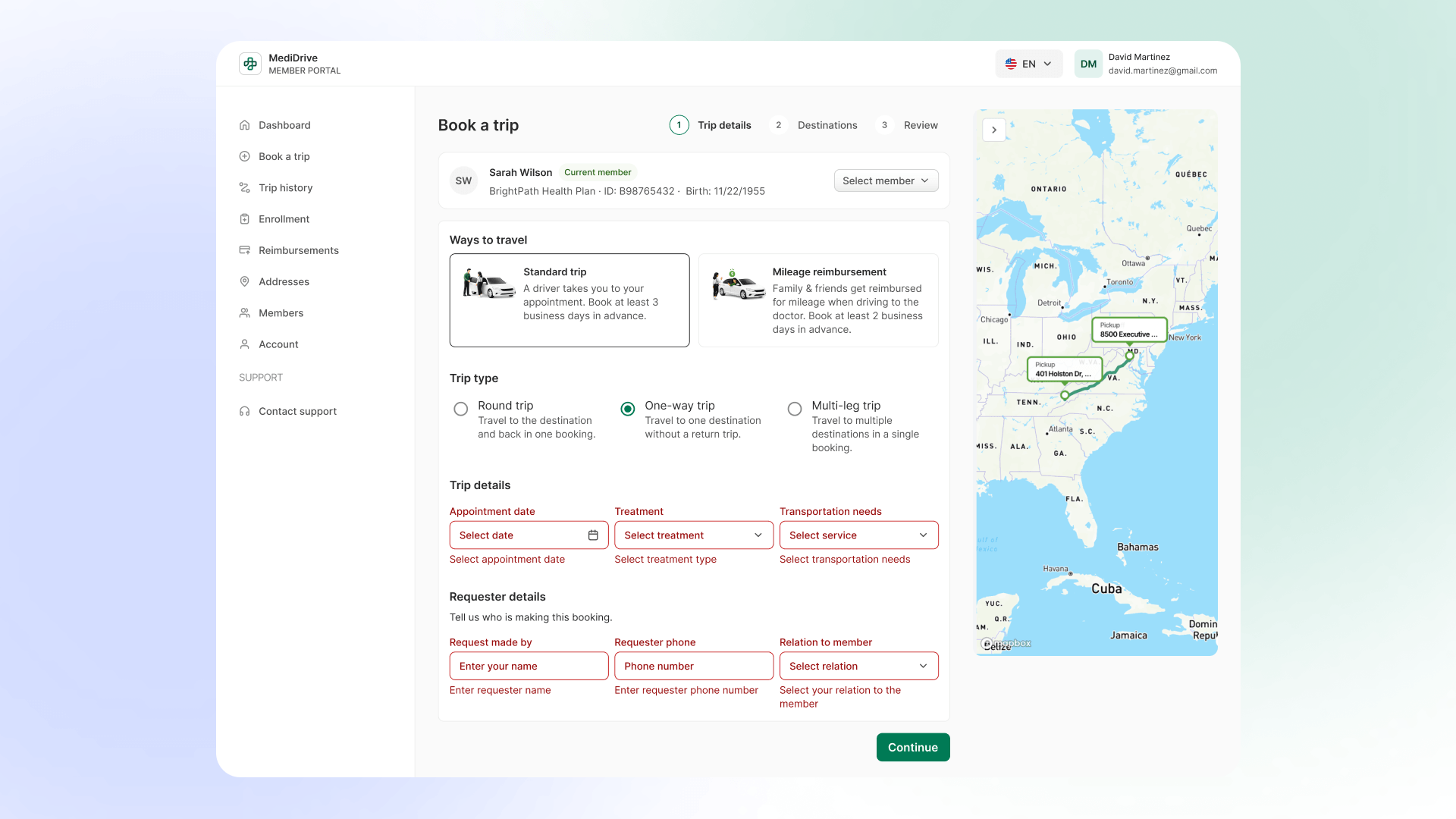
Explicit error messages and guided next steps. - 02Members are not dispatchers: Familiar, scannable, task-focused patterns (tables over operational grids); zero internal jargon.
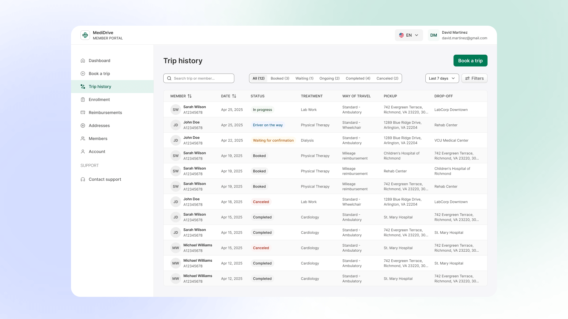
Familiar, scannable, task-focused patterns (tables over operational grids) - 03Accessibility is the floor: Keyboard operability and AA contrast designed in from the flow up, verified against WCAG 2.1 — with older adults as the primary design target, not an edge case.
The redesign
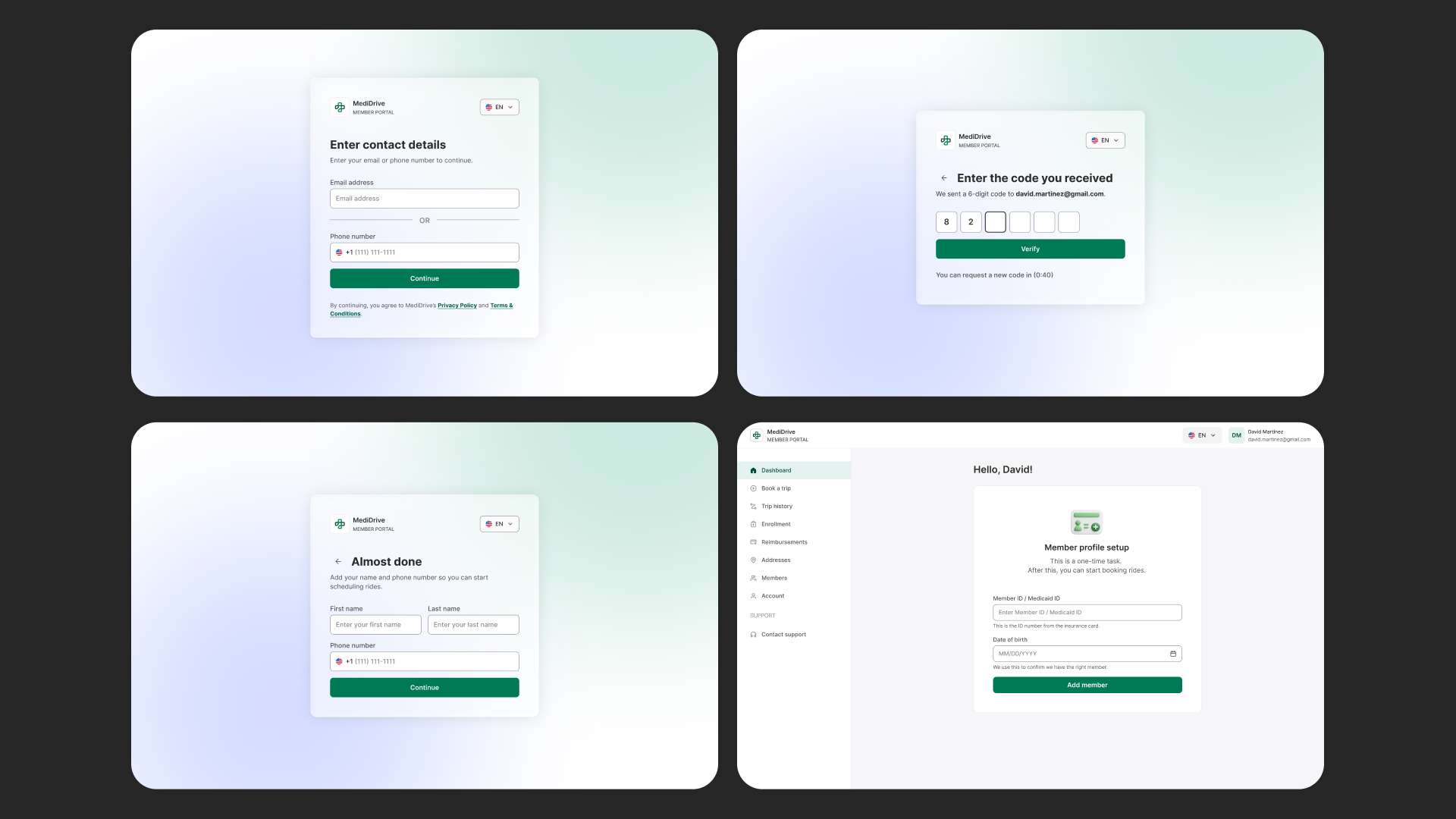
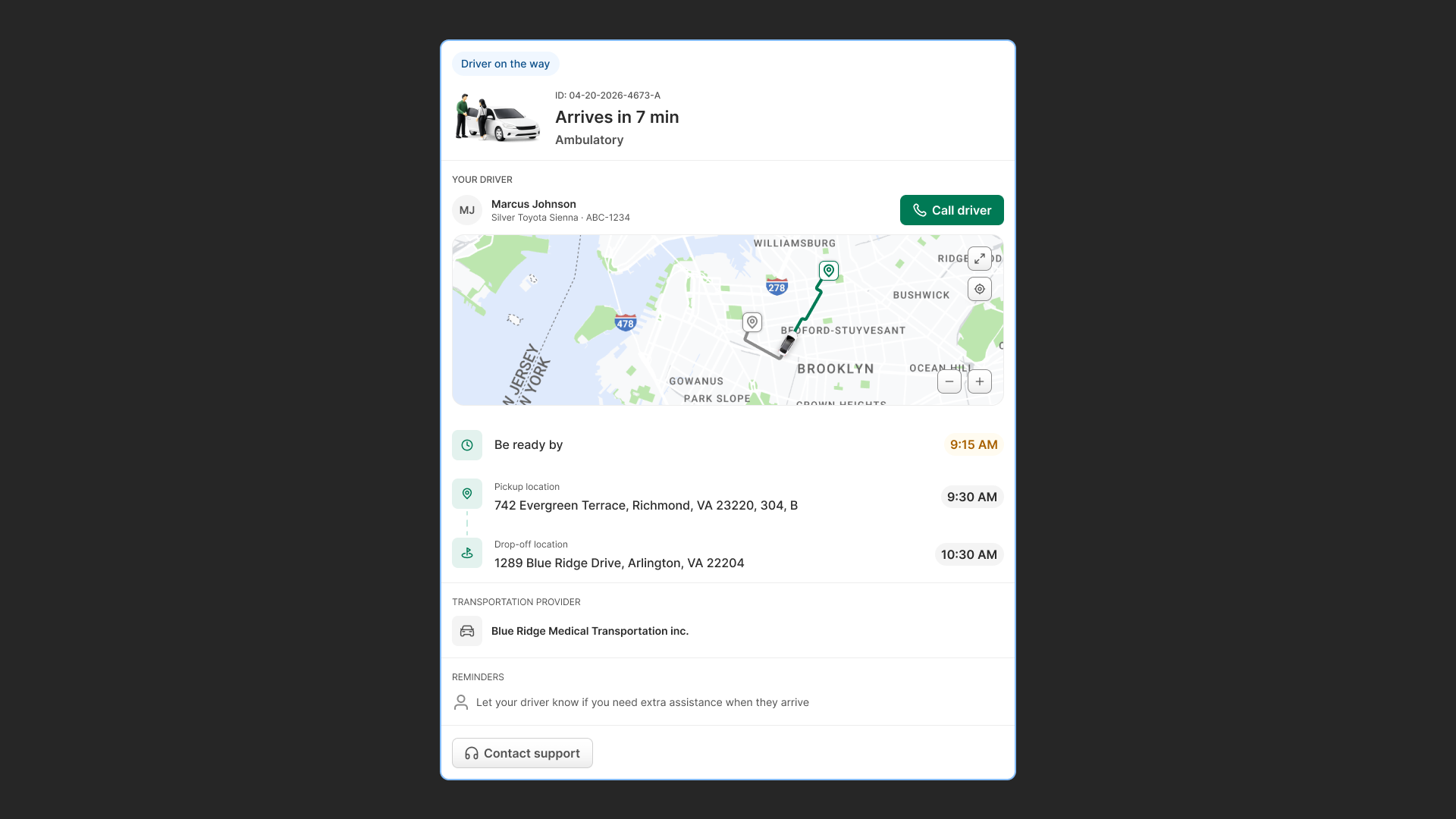
I rebuilt all four flows and delivered the full screen set in light and dark mode, plus a Colorado state-specific variant set (state Medicaid programs differ in requirements and language — handled as a deliberate variant layer, not hardcoded exceptions).
Clear, self-explaining error & block states
- Problem
- Users were frequently blocked by disabled buttons or silent validation errors without feedback.
- Change
- Redesigned every form and action point so that disabled buttons display contextual helper messages indicating missing required fields.
- Why
- Eliminates guesswork and keeps anxious or less tech-savvy members moving forward without needing to call support.
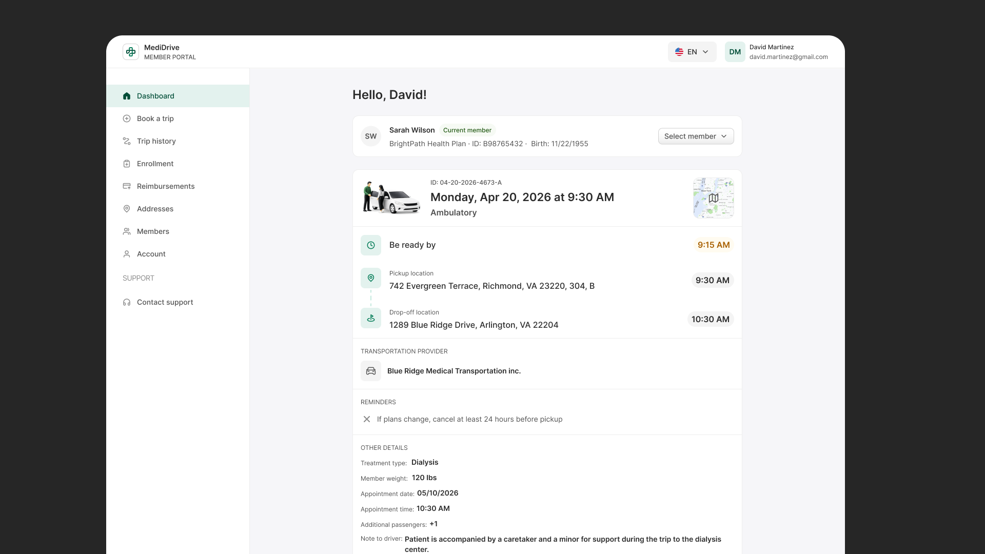
Task-focused member tables over operational grids
- Problem
- Members had to parse multi-column dispatcher tables with internal jargon like "Trip IDs" and "Legs".
- Change
- Replaced dense grids with clean, scannable member tables highlighting date, destination, driver status, and simple human actions.
- Why
- Aligns with the member mental model, drastically lowering cognitive load and reading friction.
First-run member onboarding priority
- Problem
- First-time logins immediately dropped users into booking forms without identifying who the trip was for.
- Change
- Structured first-run onboarding to prioritize adding a member and confirming Medicaid details prior to booking.
- Why
- Prevents the most expensive error in the ecosystem — booking a medical trip under the wrong account.
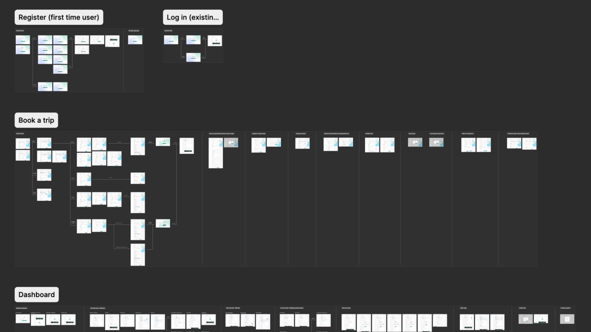
Designing for accessibility (design stage)
The portal isn’t in development yet, so I’m not claiming verified conformance — there’s no built product to test. What I can show is accessibility designed in from the flow up, targeting WCAG 2.1 AA, with the specific failures from the audit resolved in the design:
- 01Keyboard operability — the audit’s most serious finding, "these inputs can’t be filled out by using a keyboard" (WCAG 2.1.1, Level A), designed out completely.
- 02Contrast — AA-contrast tokens replacing the repeated low-contrast callouts (WCAG 1.4.3).
- 03Error identification and status — errors that no longer fire prematurely, and blocked states that explain themselves (WCAG 3.3.1, 4.1.3) — the change that most directly protects an anxious, older user from thinking they’ve done something wrong.
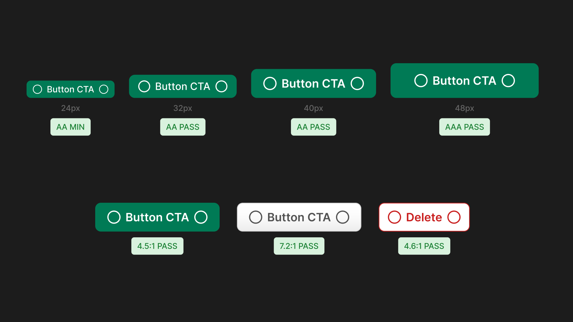
Accessibility specifications: keyboard focus navigation states, 44px+ touch targets, and WCAG AA contrast rules.
The honest next step is verification against the built product. An accessibility audit plus usability sessions with real members, before any formal conformance claim is made.
How we’ll measure success
No reliable pre-redesign baseline existed, so this is a measurement plan, not a results claim: baseline is established at launch and actuals reported at 90 days. Four metrics tracked from day one, each tied to a problem the audit surfaced:
- 01Onboarding completion rate: % of users who finish profile setup and make their first booking without calling for help.
- 02Self-service rate: % of bookings completed independently: no dispatcher contact, no support call.
- 03Booking error rate: % of submitted bookings requiring correction, cancellation, or support contact.
- 04Support contact rate: Inbound support contacts per 100 booking attempts — the clearest single signal of user friction.
Reflection
Designing for older, less tech-savvy members was a new challenge for me. The lens I used was my own parents: build something they could use on their own, with feedback at every step — feedback that guides rather than alarms. That’s not a sentiment; it’s a design rule that shows up in specific decisions here. It’s why "the error state appears too early… may cause them to stop or second-guess themselves" was flagged critical, why no state is allowed to fail silently, and why the whole point is a member who can complete a booking without calling for help.
Next project
Restructuring MediDrive’s state NEMT pages